
01 / Cream or cool white
Compare temperature, light or deep color, clarity, and contrast with a repeatable quiz that keeps unresolved axes visible. Open the detector
color analysis quiz
The short answer: a color analysis quiz should measure four visible relationships, not guess a season from one selfie. Compare whether colors look warmer or cooler beside your face, whether light or deep colors keep your features clear, whether bright or muted colors calm the surface, and whether high-contrast or blended combinations stay coherent. Use repeatable daylight comparisons and treat the result as a candidate palette direction. This quiz therefore returns a starting family and any axis that still needs another look instead of pretending that eight choices can certify a season.
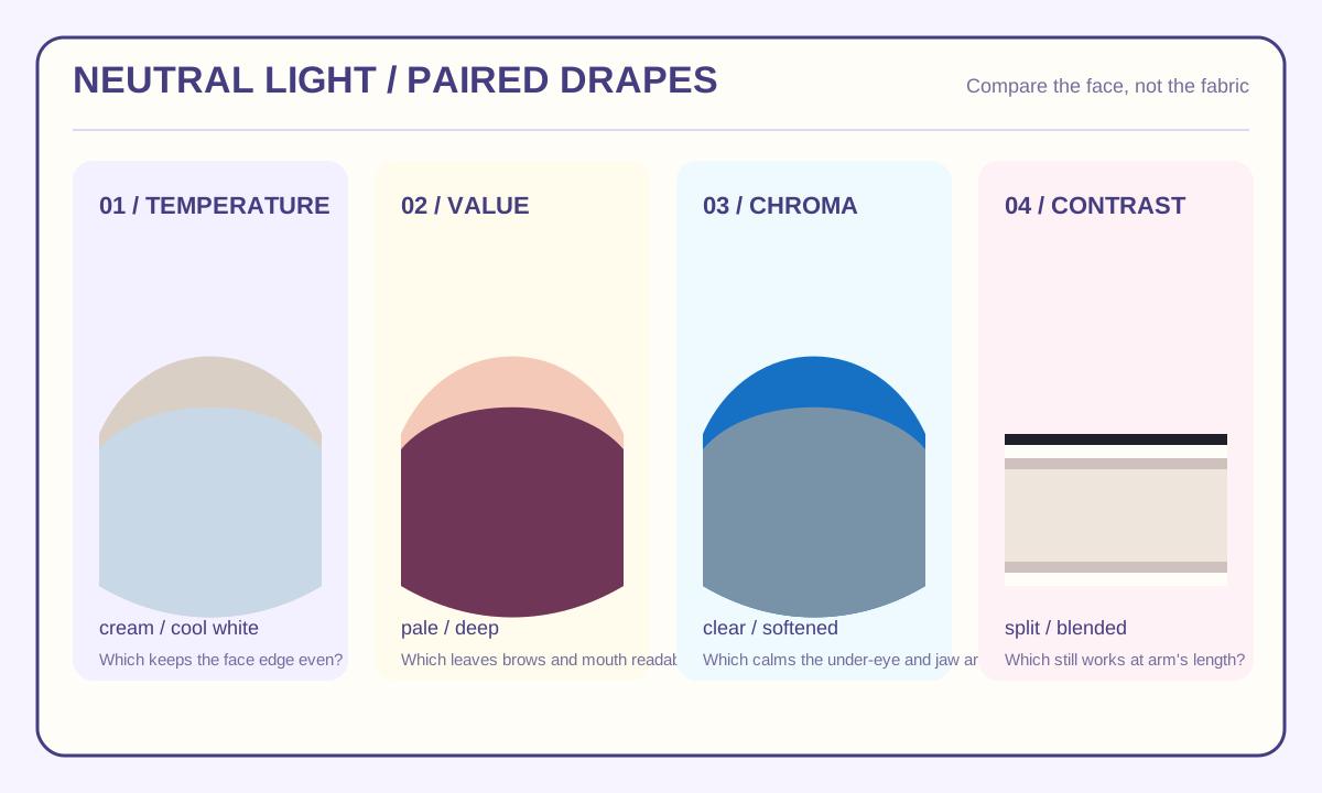
Eight paired comparisons
Build a provisional color direction
Use physical fabrics or household objects in indirect daylight. Choose the option that leaves the face more even, not the color you prefer.
02 / Warm coral or blue-leaning rose
03 / Gold taupe or silver gray
04 / Pale or deep version of one color
05 / Light aqua or deep navy
06 / Clear cobalt or dusty blue
07 / Clear tomato or muted brick
08 / Black and white or taupe and cream
0 of 8 comparisons recorded
Your result is not ready yet.
Answer all 8 paired comparisons. A partial set is shown as incomplete rather than converted into a season guess.
Prepare the comparison before taking the quiz
The useful part of a color analysis quiz is the comparison method around it. Put away colored makeup, tinted glasses, and a colored shirt for the setup. Sit beside a window with indirect daylight, keep the camera or mirror at eye level, and repeat the questions at roughly the same time on two different days. If the light changes between answers, the result describes the room as much as it describes color beside your face.
Color perception is not a property that survives every viewing condition unchanged. Hue, lightness, and colorfulness appear differently under different light, next to different surrounding colors, and after the eye adapts. That is why a saturated yellow wall or a phone's automatic white balance can move an answer. A neutral wall, a white or mid-gray reference, and daylight without direct sun give the quiz a cleaner starting point.
Use a clean face or the same light makeup both times if makeup is part of your normal routine. Do not switch between bare skin, a full-coverage base, and a strong lipstick while testing temperature. A colored foundation can cover the exact surface variation you are trying to compare. If your neck and face have visibly different surface colors, judge the paired drapes beside both areas and record the disagreement rather than forcing one answer.
What the four quiz axes mean
The quiz separates four questions that are often collapsed into one vague idea of "finding your colors."
| Axis | What you compare | What the result can suggest |
|---|---|---|
| Temperature | Warm gold-leaning versus cool blue- or rose-leaning color beside the face | A warm, cool, or unresolved direction |
| Value | Light versus deep versions of a similar color | Whether light or rich depth repeatedly keeps the face readable |
| Chroma | Clear, saturated color versus softened, grayed color | Whether brightness or restraint is the more comfortable direction |
| Contrast | A strong light-dark pair versus a close tonal pair | Whether the face carries separation or blended combinations more easily |
These axes can disagree. A person may prefer cool colors but still need enough depth to avoid looking washed out. Another person may look balanced in a muted warm color and unbalanced in a bright warm one. A quiz that returns only "spring" or "winter" after one answer hides those distinctions. Record the four directional readings first, then name the family that best matches the combination.
Use paired comparisons, not isolated swatches
An isolated color tells you very little. Hold two options beside the face in the same light and compare them in this order:
- Temperature pair: compare a cream with a cool white, or a warm coral with a blue-leaning rose. Ask which one makes the edge of the face look more even rather than which one you like better.
- Value pair: compare a pale version with a deep version of one color family. Watch whether the lighter option erases the mouth and brows or the darker option overwhelms them.
- Chroma pair: compare a clear color with a softened version. Look at the under-eye area, around the nose, and along the jaw rather than staring at the center of the cheek.
- Contrast pair: compare one outfit or drape with a strong light-dark split and one with a narrow tonal range. Step back to arm's length; the closer view exaggerates both choices.
Repeat every pair in reverse order. If the first fabric looks better only because it was presented first, the preference is not stable enough to use. For the strongest signal, ask which color disappears into a useful frame and which one becomes the object you notice first.
Read movement instead of chasing a perfect still
Take one neutral photo and one short video for each shortlisted direction. Keep the exposure and background fixed. In the video, look down, smile, turn three-quarters toward the light, and return to center. The winning direction should remain reasonably stable through those movements.
- Neutral frame: the color does not make the center of the face look gray, yellow, or flushed compared with the control.
- Smile: the color still supports the face when the cheeks move upward.
- Three-quarter turn: the effect survives a shadow crossing part of the face.
- Arm's length: the overall outfit and face still look connected rather than separated into competing color zones.
The result does not need to flatter every adjacent color. A useful palette is a shortlist of colors that keeps the face legible under ordinary conditions. If the same axis fails twice, move it from a "season verdict" to a follow-up question. That is a better outcome than changing several products, backgrounds, and lighting conditions until the answer resembles the season you expected.
Temperature is not a vein test
Warm and cool are comparison words. They are not a measurement of health, ancestry, or a person's value. A vein that looks greenish or bluish can be influenced by light and skin thickness; it is too fragile to stand alone as proof of undertone. Use jewelry and shirt comparisons as repeated observations, then confirm the direction with a second pair under the same light.
The warm side of the quiz asks whether cream, warm coral, olive, and gold-leaning neutrals repeatedly sit more coherently beside the face. The cool side asks the same question for cool white, rose, blue, and silver-leaning neutrals. Neither answer needs to apply to every color. A person can wear a cool blue for contrast while finding that warm neutral colors make the face look calmer.
Depth and clarity can split the result
Two common conflicts explain why an online quiz can feel inconsistent:
- Cool but deep: cool colors clear the surface, but pale shades disappear. The candidate direction needs coolness plus enough value contrast.
- Warm but muted: gold-leaning colors are easier than ice-cold shades, yet intense saturation dominates the face. The candidate direction needs warmth with restraint.
When the axes split, do not average them into a neutral answer. Keep the exact conflict. "Cool direction; depth unresolved" gives you a useful next test. "Summer" or "Winter" without that note can send you toward a palette that solves only half the observation.
Validate with a two-session ledger
Use a simple note on your phone for the first session and four to seven days later:
- Record the light source, time of day, and whether direct sun was present.
- Record the winner for temperature, value, chroma, and contrast.
- Name the fabric or object used for each winner.
- Note which axis changed between sessions.
- Repeat only the changed pair in the next test.
If three or more axes stay stable, the candidate family is useful enough to trial in clothing. If two or more axes reverse, stop shopping from the result and check whether the light, makeup, camera, or background changed. A professional draping session can add another observation, but it should still be treated as a second method rather than an absolute authority.
What the season family can and cannot tell you
The quiz maps the combined directions to four broad families. A warm, clearer, lighter or higher-contrast result points toward a spring-like starting palette. A cool, softer, lighter or lower-contrast result points toward a summer-like direction. A warm, softer, deeper result points toward autumn-like neutrals. A cool, clearer, deeper, higher-contrast result points toward winter-like separation.
Those labels are shorthand for color behavior, not measurements of identity or beauty. They do not determine which colors you are allowed to wear, and they do not override comfort or culture. Use the family to build a small test group: one neutral, one light, one deep, one clearer accent, and one softer accent. Keep the pieces that continue to work in daylight, office light, and evening light.
For the adjacent undertone step, use this site's [skin tone analysis](/skin-tone-analysis) before turning a quiz result into a makeup foundation match. The two pages answer different questions: the quiz describes color relationships around the face, while the skin tone page separates surface color from undertone and lighting. For the geometry side of a face-reading workflow, compare the [face shape detector guide](/face-shape-detector-guide), the [face shape chart](/face-shape-chart), and [what is my face shape](/what-is-my-face-shape).
When to distrust the result
Do not accept the quiz output when the photos were taken with different white balance, the face is lit by a colored screen, the background changes between answers, or the comparison fabric reflects a strong color onto the skin. Do not use a single selfie as a universal verdict. Do not compare two images taken in different seasons without preserving the light and exposure settings.
Finally, separate a color preference from a color effect. You may love a shade that is not your easiest neutral. That is a legitimate styling choice. The quiz is only trying to identify which colors need less correction under controlled conditions; it is not asking you to remove every other color from your wardrobe.
Color quiz questions
Is a color analysis quiz accurate from one photo?
One photo can produce a candidate direction, but it cannot prove a season. Phone white balance, makeup, background color, and compression can change the surface colors you see. Repeat the paired comparisons in stable daylight and keep the result provisional.
What should I compare for a warm versus cool result?
Compare cream with cool white, warm coral with blue-leaning rose, and gold-leaning neutrals with silver-leaning neutrals. Use the same light and look at the face rather than judging the fabric by itself.
Why do I get a different season every time I take a quiz?
The quiz may be mixing temperature, depth, clarity, and contrast into one score. It may also be using different photo conditions. Record those four axes separately so a single unstable pair does not rename the whole result.
Can a color analysis quiz tell me my undertone?
No. It can describe how colors behave beside your face, but undertone requires a separate skin-tone comparison under controlled light. Use [skin tone analysis](/skin-tone-analysis) before matching base makeup or drawing a health conclusion.
Should I change my wardrobe after one result?
No. Trial the candidate neutral and two accent directions first. Keep the result only if it survives daylight, a different room, movement, and a second session. Color analysis is a practical filter, not a rulebook.
The most useful color analysis quiz gives you a candidate direction, the axis that is still uncertain, and a next comparison to run. That is more dependable than a dramatic season label built on one uncertain photo.
KEEP EXPLORING